On Friday, October 10th, Krystal was delighted to sponsor WDC2025, a one-day conference in Bristol focusing on design, development, and how to make the web a better place.
With our remit to help make a better world both offline and online, it only made sense for us to sponsor this event. And without having to run a stand, we were also able to take in the fantastic talks by amazing speakers, and find out what's hot in the web world.
Two major themes of the day were nostalgia and joy, whether that was remembering building websites back in 1995, fixing Nintendo Game Boys, or seeing what astounding things can be done today with just CSS. It was also a time to reflect on how the web became what it is today, what the web will be in the future, and how we can work together to build it all better.
Here are some short notes about the talks given.
Tey Bannerman — The time loop: How 2024 became 2004 (and why we should embrace it)
We started out the day with a nostalgia hit — Tey taking us back to 2004 and talking about the delight he got from learning how to design websites. The wonder of the tools he used, and the patience he learned waiting for his modem to load up websites.
(The Modem sound effect was used repeatedly during the day, giving everyone of a certain age a Pavlovian response.)
He then discussed how, over time, the joy seemed to fade. There was Work, which taught you discipline, but people seemed to lose their joy in making things over time, and brought up a square to show what's truly needed today.
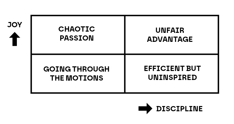
How does one have the Unfair Advantage of joy and discipline? Going out and making stuff.
He then went through the excuses people have for not doing side projects — not having the skills, being too old, and how we're all told AI will replace everything. He pointed out the power of being a generalist (referring to Range: Why Generalists Triumph in a Specialized World by David Epstein) and that the average age of the founder of the 100 biggest companies was 35 at the time, meaning that the lack of skills and your age aren't an excuse at all. He also dismissed the idea that AI would take design and development jobs, but pointed out that, for many people now, they're getting the same creative joy that many of us got when building our first websites.
His final thoughts were a four-step program for reclaiming joy in going out and making new stuff.
- Take your smallest idea and ship it.
- Reclaim one skill you abandoned.
- Start a 4-week project with a public launch date.
- Connect with one other person in the audience monthly.
So what are you waiting for? Go out and build stuff!
Henry Desroches — A Website to End All Websites
Henry started by stating flat out — "The Internet is bad". He pointed out the many problems of today's Internet, from doomscrolling to clout chasers to AI slop. And how it didn't always used to be this way, with hundreds of different experts all talking about their hobbies online. When we built our own websites and created new things. The Internet wasn't perfect, and his talk wasn't here to make people feel nostalgic, but there was something there.
He then switched to the invention of the automobile, which was a good analogy for the Internet. In the early days, the automobile was advertised focusing on access, progress, liberty, freedom, more time to create new and better things. But as time wore on, the car became less about your freedom and more about necessity. The car was no longer a tool to serve society, society was serving the car.
Henry brought up Tools for Conviviality by Ivan Illich, which included the idea of radical monopoly — where a technology becomes so dominant that anyone who cannot use it is excluded from society. And that instead of being a society that designs and uses tools to build the society, we are a society that exists to serve the needs of the tools.
But we can change that. We can have the web we want.
He pointed out all the ways we can connect with others on the web that don't involve social media, including having blogs, using RSS, webmentions, and microformats, getting into the IndieWeb, and even just sending emails to people. He recommended using Bridgy to connect your site to your social media (if that's what you want to do) and joining personalsit.es once you have your website up and running.
He finished by reminding everyone that the Internet can be reclaimed, and we can make something we're all proud of. And to "fix your hearts or die".
Lex Lofthouse — Design for Developers
Lex took the day into a different route — focusing on less on the wider aspects of the Internet and instead giving actionable advice for developers who need to design. She focused on four principles of design:
Hierarchy
How items are arranged according to their importance, which can be easily implemented by design features like scale.
Contrast
How items are opposite to each other, such as highlighting an element on a page against another element. Contrast is also important for accessibility, as text needs to have a high contrast from the background for readability.
Proximity
The relationships elements have with each other on the site, including the distance and lack thereof. This is why white space can be extremely important on a site.
Balance
The visual distribution of weight across the screen, reinforcing familiar patterns and helping you to make decisions.
With these four principles in mind, Lex then went through several design choices that need to be made when creating sites.
Typography
She recommended font pairings — one for headings and one for paragraphs. Headings can be bold, stylised, and interesting, but paragraphs need to be easy to read, especially at smaller sizes. This not only brings balance to your site, but also indicates the hierarchy. She recommended trying out fonts at Fontpair, to see what would work best for your brand.
Paragraph font size should not go below 16px, to help with legibility, and you can work out the scale of your headings versus your paragraphs with sites such as Typescale The line height should not be too narrow or too wide, finding the right balance so that people can read the paragraph as a single item. There should be spaces where there are clear breaks in the text and the space between the paragraphs and the heading should be the same, with the space between the paragraph and the next heading slightly larger to provide a clearer proximity break.
Colour
A main colour palette should be a small set you use across your brand. She cited Uber as an example, showing how they only used three colours — mostly black and white, with blue as an accent. Then bring in a supporting palette, which can have more colours, but makes it clear that this is secondary content. And, finally, have a neutral palette of shades to add a bit more depth and flexibility, making sure that if your main colours are warm or cool, the neutral palette matches.
Contrast is vital for accessibility, especially when it comes to text. Use WebAIM's Contrast Checker and do not rely on just colour to indicate things.
Iconography
When you use icons, remember that they rely on a lot of assumptions, and that what you might think an icon represents isn't universal. Give them labels to indicate what they mean.
Imagery
Using properly licensed stock imagery is absolutely essential — and Unsplash and Pexels are good starts. She stressed not using AI images, not only because they're trained on other people's artwork, but that there's the AI "orange disease", where everything has a yellow tint (and, in fact, someone else has made another AI to remove it).
Layout
Lex pointed out how useful a 12 column grid is. Not only can it be divided by 2, 3, 4, and 6, it makes for a versatile and responsive design. She also focused on the need for repetition in the UI, giving your users the familiarity they need. Brad Frost's Atomic Design gives you the details you need to build a good components-based system to help your designs.
Refinement
Lex went through the stages of design refinement with several examples, including real estate listings, radio buttons, and a cat rescue. By experimenting while also keeping the fundamentals in mind, you can quickly make your designer's life a lot easier.
Scott Riley — Rapid-fire advice from a burned out gobshite
Scott was a last-minute addition to the day, but was an absolutely perfect inclusion. His fast-talking, fast-going list of tips gave everyone something to think about while also making us laugh. He not only provided great advice, he also kept the promotion of his Mindful Design course to a minimum...almost.
Here are just some of the advice he gave in an incredibly fast 15 minutes:
General
- "I asked ChatGPT..." is not a replacement for a personality.
- Spend more time in the lo-fi world — go outside and touch grass.
- Designers, learn to code.
- Developers, learn to design.
- Everyone, learn to collaborate.
- Learn what Seagull Management is and how to spot it in the workplace.
Typography
- Choose your typography by starting with your body copy.
- Learn type legibility and how to make it work.
- Larger x-height is always good.
- Low-to-medium stroke contrast is also great.
- Open apertures and wide counters are good.
- Don't use obliques or faux-bold, use the proper weights.
- Use a fluid type scale.
- Generators are fine to use, we all use them, including Utopia.fyi
Code
- Using React or Svelte is also not a replacement for a personality.
- Try going framework-free.
- Web components are awesome.
- Vanilla JavaScript is great, even if Brendan Eich isn't.
clamp()is your friend.- Go offline-first for everything — persist things to storage, do indexdb, etc.
- CSS is a real programming language.
- If it's not accessible, it's garbage.
Even More General
- Learn to think in systems.
- Stop designing so many linear flows.
- SaaS is not the only way to ship products.
- Don't wait until you've been freelancing for 15 years before you start putting money in a pension — compound interest is good.
- Get an accountant.
- Keep a project diary.
- Delete your backlog every 3 months as self-care.
- Have FUN, side projects are not work, do not think about scalability.
- Make cool things with your cool mates.
Diagrams
- There are two diagrams you need to know:
- The four rectangles/two lines where two aspects measure up against each other
- The affinity map
Michael Kibedi — Death, and how tech forgot about mortality
Michael had all of us thinking seriously about how we connect to the web, and how we reflect on mortality. He started by pointing out Awesome Falsehoods, filled with lists of things people believe but that aren't true, and from there, went through the falsehoods that exist concerning mortality and digital services. He split the falsehoods into three main concepts: Person, Platforms, and Pieces.
Person
The first falsehood was that most of us have a plan for our death. This is something easy to debunk, as three in five UK adults have not made a will, and that just deals with physical assets. What about your digital world?
This is the second falsehood — that our digital selves are consistent. Online lives are messy, unpredictable, and happen all over the place, across many different platforms. And those different platforms will have different versions of the same person — some will be public, some will be private, and some will be secret. Who will get ownership of your personal profile? Who gets access to your thoughts and secrets?
The third falsehood focuses on this question. That death ends our digital existence. The "grief tech" sector is developing quickly, where they can, by using AI, essentially "reanimate" the dead. But should they?
He referred to Mortevivum: Photography and the Politics of the Visual by Kimberley Juanita Brown and The Afterlife of Data: What Happens to Your Information When You Die and Why You Should Care by Carl Onman, both looking at what happens with your image after you die, and who can use it. This was especially driven home by referring to the Tupac Shakur "hologram" that "performed" at Coachella 2012.
Platforms
Michael then asked us what we would do if our favourite app shut down tomorrow. What would you lose? Who would you be unable to speak to? What would happen?
He brought up how he used to regularly use Bebo as his social network, and that when it shut down, they shuttered the entire network, with none of the data that the users created kept. This was the first falsehood for platforms — that they are obliged to provide a public service. They are private corporations that have no civic or moral obligation to you, the user, and can and will shut down at any time.
Which is the second falsehood, that platforms will always be here. Takeovers, strategy changes, bankruptcy, and other factors all affect platforms, and the shift from Twitter to X is the best most recent example. However, anyone who has been on the Internet for a few years can name even more examples.
The final falsehood focuses less on the actual platform and more on the user base. Platforms seem to think that all their users are alive, and that if a user isn't engaging with the site, the account can be removed. This came up when Twitter considered culling accounts that hadn't been accessed in years, but faced a backlash as many of these accounts were attached to deceased people, and losing their accounts could mean losing valuable historical information.
Michael also referred to Death Glitch: How Techno-Solutionism Fails Us in This Life and Beyond by Tamara Kneese.
Pieces
The final falsehood focused on one of the more prominent falsehoods perpetuated on the Internet. If data is saved, it's safe. The Internet is made of hardware housed in concrete buildings, and despite being able to read books from 1,000 years ago, we have a hard time reading data from 50 years ago.
Hardware failure, obsolescence, and bitrot (the decay of the electromagnetic charge in storage media) will keep threatening saved data.
Michael quoted from Internet for the People: The Fight for Our Digital Future by Ben Tarnoff. "Data is made collectively and made valuable collectively. It follows that governance should also be collective ... crucially the ownership of data would be separated from its processing."
What can be done?
Michael finished with practical questions that should be raised.
- What should our service do when a user dies?
- How will users get their data back if our service ends?
- Will our users' data be accessible in 50 years?
Salma Alam-Naylor — An introduction to the World Wide Web for Very Senior Programmers
The post-lunch talk is always difficult, and WDC lucked out with Salma's entertaining time travel adventure.
We went back to December 15, 1995, when HTML 2.0 had recently been released, with plenty of new features available, such as <IMG> and <ISMAP>, as well as a brand new programming language called JavaScript and the possibility of something called Cascading HTML style sheets.
She took us through all the exciting new possibilities, from Macromedia Shockwave Player to Visual Basic to Beverly Hills Internet (recently renamed to Geocities) to FrontPage 1.0.
It was delightful, it was ridiculous, it was a flashback for some of the older members of the audience and a revelation for some of the younger.
Remy Sharp — How to fix a Game Boy
We kept with the retro vibe for the next talk, where well-known JavaScript developer Remy talked about his favourite hobby — restoring broken Nintendo Game Boys.
This was a fascinating look into the mechanics of Game Boys and what needs to be done to repair them. With 99.9% pure isopropyl alcohol, a tri-wing screwdriver, a soldering iron, and a multimeter with continuity mode, it's possible to fix most Game Boys, getting them ready to play Tetris right away.
You can find out more on retrobyrem, his site specifically for refurbished Game Boys.
Jhey Thompkins — Design idea to engineer
Jhey's talk was less of a talk and more an exploration of the amazing things CSS can currently do. While he included practical ideas for other people to use, they were a launchpad to show off some truly astounding coding.
He described a Design Engineer as someone who makes cool stuff with care and quality and puts it on the Internet. And the things that you should focus on are:
- Practicing the little details
- Take on "side quests"
- Do stuff and stick them into your toolbelt for later
You can see some of the examples he used on his Codepen account, including Open To Sign, Glass Displacement, Resizable Slide Panels, and Proximity Electric Border. And that doesn't even include the Bear-with-Trombone slider, the Splat SVG filter, stretchy light bulb cord, or the parachuting bears. And all done with CSS!
What were the major takeaways from the conference?
You can make amazing things with the web today. You don't have to be locked into the walled gardens of social media. You can rediscover your joy of creation through making plenty of things. And don't forget to do something that isn't coding on a laptop.
Were you at WDC and forgot to say hi? You can still say hi on Facebook, LinkedIn, Instagram, BlueSky, or Mastodon!
Share this article
About the author
Kate B
I'm Kate, and I'm one of the Senior Marketing Managers here at Krystal. I'm a transplanted Southern Californian who likes bad pop culture, the Internet, and talking everyone's ears off about web hosting. Howdy!